Monday, November 25, 2013
Project #4 Reflection
I found it easy to think of ideas for a theme for the art curator exhibition project. At first I wanted to do a 70's/bohemian themed exhibit, but found it hard to find artworks that matched that theme. So I came across a lot of nature related artworks such as flowers, animals and mountains while doing further research. I ended up choosing beaches as my theme. I named the exhibit "I Can Still Hear The Waves" since a majority of the artworks focused on the waves of the ocean, and the painting depicted real life beaches and are so detailed that the viewer feels like they are really on a sunny and exotic beach with the waves crashing down. I chose a font for the title that reminded me of writing your name into the sand , and the backgrounds for all of the slides was a pale blue that gives the exhibit a sense of calmness throughout the collection. I couldn't use the Bradley Hand font throughout the whole exhibit because I felt like it made the words hard to read, but I would have liked to use it. Also I arranged the artworks in a sequence from sunrise to sunset. So by going through the whole collection you kind of get to see a full day at the beach. From the calmness of the morning, to a beach party, to sunset, and to the darkness of the night. The websites that were given in the resource section were very helpful and made putting the PowerPoint together, really quick and easy. I had the most trouble with writing about the artworks since they are all about the beach it got very repetitive. But other than that I had no trouble coming up with a concept and putting it all together with fonts, colors and backgrounds that helped to reinforce my chosen theme better.
Saturday, November 23, 2013
Module #13 & #14
#1. Key Concepts:
The Lowdown on
Lowbrow: West Coast Pop Art
-Lowbrow art is art that isn’t categorized as any other type
of art, it is a class all its own
-Pop culture, car culture, and folk art have had major
influences in the genre
-Lowbrow had pop culture and consumer references
- Some galleries were not willing to display Lowbrow art
-There was unwillingness of the mainstream art world to
accept Lowbrow
-Emergence of female artists in Lowbrow
-The punk rock generation propelled Lowbrow art culture
Displaying Modern
Art: The Tate Approach
-The intellectual and aesthetic issues associated with the
display of art
-Typically art was displayed in chronological order,
representing each art movement
- Also the art was displayed on white walls with flexible
lighting
-In 1970, these traditional way were questioned and art came
off the walls to become busy and noisy
- The Tate Modern display approach
-Tate provided striking and often abrupt transitions between
the individual display rooms
- Critics believed art should be more than entertainment
Bones of Contention: Native
American Archaeology
-The remains of
more than 10,000 Native Americans unearthed at archaeological sites across the
U.S are in the possession of museums like the Smithsonian
-Anthropologists differ on whether or not the remains should
be returned to their ancestors
-Now, Native Americans design the exhibits in New York’s
Native American Museum
- Ancestors’ bones continue to be brought home
-Archaeology must share responsibility for stewarding the
past
An Acquiring Mind:
Philippe de Montebello and The Metropolitan
-Philippe de
Montebello
- Served for 31 years as Director of The Metropolitan Museum
of Art
-He guided the acquisition of more than 84,000 works of art
-He also demanded innovation in conservation techniques, and
oversaw the doubling of the physical size of the institution
#2. The videos relate to the creation of my Art Exhibition
project, since they talked about what type of art should be in an exhibit, how
it should be displayed, what influences art displays, and what shouldn’t be a
part of an exhibit.
#3. My favorite film was the The Lowdown on Lowbrow: West
Coast Pop Art, it was like an exhibit that had no theme, which is the opposite of
our project. But it was interesting to learn about Lowbrow which I’ve never
heard of.
Saturday, November 16, 2013
Module #12 Video Review
#1 I chose
the video Andy Warhol: Images of an Image because I really like his work and
the way he incorporates advertising into his work. I also chose the video Abstract
Expressionism and Pop: Art of the ’50s and ’60s because I like the emotion
surrounding the expressionism movement and because the 60’s was my favorite
decade.
#2. Key
Concepts
Andy Warhol: Images of an Image:
-Was a
commercial artist and used advertising images in his work
-Was
inspired by famous women such as Marilyn Monroe and Elizabeth Taylor
-Used silk
screening
-Photographs
were blown up and developed onto silk screens, then transferred to paper and
canvas using ink and paint
-Ten Lizes,
1963
-Used
consumer products as repeated silk screen images
-Shot about
100 films
- Produced
dozens of self portraits
-His work
addressed race riots, the conquest of the moon, the cultural revolution in
China, and the universal reign of the dollar
Abstract Expressionism and Pop: Art of the
’50s and ’60s:
-Abstract
Expressionism was born from joining the attitudes of American art and European
avant-garde art
-It was
later rejected for its nonfigurative and egocentric character and replaced by
the ultra- objective phenomenon, Pop Art
-The video
shows how various artists used expressionism in their art and the change to Pop
Art
-Frankenthaler:
feminine and mystical, and makes the observer experience a warming and
exhilarating sense of fruitfulness (expressionism)
- Andy Warhol: most famous artist of the Pop Art movement,
the first 20th Century art movement since Futurism to embrace the
rhythms of city life
#3. The
videos and the text both talk about when and how the Expressionism and Pop Art
movement started, art works and artists during these movements, and what inspired
Andy Warhol’s commercial and advertising based art.
#4. The films
helped me to learn about the leaders of these art movements and the
characteristics involved with these works of arts that define Expressionism and
Pop Art.
Sunday, November 10, 2013
Art Gallery Visit #2
Step #1: The
Exhibition
#1. What is
the title of the exhibit?
-Illusion/Delusion
by Ben Perrone, at the Burchfield Penny Art Center.
#2. What is
the theme of the exhibition?
-The
installation is a tribute to the servicemen and women who died in Iraq.
Step #2: The
Gallery
#1. What
type of lighting is used?
-Track
lighting is used to focus the viewer to the artwork since the light shines
directly on the pieces. The rest of the exhibit had dim lighting to eliminate
the unused space and create a sense of ambiance.
#2. What
colors are used on the walls?
-The walls
were painted white, I think that having colorful walls would distract from the
artwork.
#3. What materials
are used in the interior architecture of the space?
-The walls
of the gallery were made of drywall, and there were glass doors that led you
into the gallery. The gallery is pretty basic and plain, since it is all about
the art.
#4. How is
the movement of the viewer through the gallery space?
-The gallery
kind of reminds me of a smaller and simpler version if a corn maze. The viewer
gets to pick which way to go, but there is no right way. Each path leads to
more rooms and exhibits when you thought you saw all there was to see you come
across another path. This provides an
unique experience for each person.
Step #3: The
Artwork
#1. How are
the artworks organized?
-The artwork
is organized by exhibit and I noticed that the art is hung at eye level and is
level with all the other artworks in the exhibit.
#2. How are
the artworks similar?
-There were
multiple display cases with pictures of servicemen and news articles. All these
things represent one common theme, the unnecessary loss of life.
#3. How are
the artworks different?
-The artworks
were different because some were very literally like the photos of the
servicemen while some were very abstract like the hanging black bags that
represent each life lost in Iraq.
#4. How are
the artwork framed?
-The art work
in the exhibit I visited, Illusion/Delusion was set on top of cream canvas in a
glass frame with a very thin silver border.
#5. How are
the artworks identified and labeled?
-Not all the
artworks throughout the gallery and the exhibit were labeled. But when they were
there was a small white plac underneath the art with all the info about it. Such
as the artist, title, date, media, and sometimes a short description of the
art.
#6. What is
the proximity of the artwork to each other?
-The
artworks in the Illusion/Delusion exhibit were spread very far apart which kept
the viewer moving and every inch of the gallery was utilized.


The artwork Rose Black is very dark with black and a dark rust color. The darkness is broken up by a strip of cream with black spots and strokes. The artist uses value with the contrast of dark and light. Emphasis is used since the eye is brought directly to the lighter portion of the painting. The black strokes also give the painting texture and movement. Since the whole exhibit was about the tragedies in Iraq I think the light portion represents hope, kind of like there is a light and the end of tunnel.
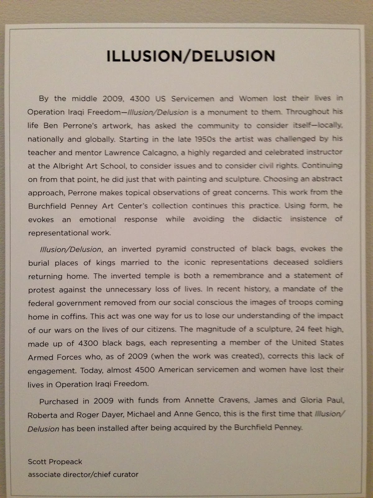
Artwork #3
Ben Perrone
Illusion/Delusion
Black paper bags and monofilament
2009
252x252x252 inches
 Ben Perrone’s installation is a tribute to the Servicemen and Women who died in Iraq. The 28 ft installation shows the enormity and impact of war. Perrone stated that "an inverted pyramid constructed of black bags evokes the burial places of kings married to the iconic representations deceased soldiers returning home. The inverted temple is both a remembrance and a statement of protest against the unnecessary loss of lives".
Along with the installation there was a video playing that showed the artist hand writing the names of the people who lost their lives and putting the names into the bags. It some galleries this installation is hug in front of the entrance so people have to walk through the sea of bags, as if they are being touched by the lives that were lost.
The artist uses proportion to guide the viewers eye up the installation. Having the bags arranged like an upside down pyramid draws the eye up and creates movement. Light is also used by shining it from the bottom to create emphasis on the piece since the rest of the exhibit was pretty dim. The 3D bags also gave the installation texture.
What did you think of visiting the Gallery and purposefully looking at the exhibition from a different perspective - the physical space, the architecture, theme, etc.?
I thought it was a cool experience to look at things other than the artwork. I never really pick up on the architecture of the building, the lighting, etc. For the first part of the assignment i was basically ignoring the artwork which is an ironic thing to do at an art museum.
Artwork #1.
Adele Rieger
Cohen
Untitled
Oil on paper
1965

The painting is if a circle with a black background, half of the circle is dark while the other is a little bit lighter. In the center it looks like the silhouette of a women to me. The artist uses shape through the use of the circle. There is emphasis on the light "face" of the women since the rest of the painting is dark with the colors black and red. Balance is used by having the "women" directly in the middle of the circle and there is not more empty space on one side then the other. I really can't tell what the artist is trying to convey because it seems really abstract to me. But to me it looks like a women covering her mouth with her arm as if she can't go on or is not supposed to talk. She is also going to the lighter side of the circle, like the darker side was the dark past she was walking away from . In this case the past would be the war since that was the theme of exhibit.
Artwork #2
Lawrence Calcagno
Rose Black
Watercolor and gouache on paper
1956
29 3/4 x 21 3/4 inches


The artwork Rose Black is very dark with black and a dark rust color. The darkness is broken up by a strip of cream with black spots and strokes. The artist uses value with the contrast of dark and light. Emphasis is used since the eye is brought directly to the lighter portion of the painting. The black strokes also give the painting texture and movement. Since the whole exhibit was about the tragedies in Iraq I think the light portion represents hope, kind of like there is a light and the end of tunnel.
Artwork #3
Ben Perrone
Illusion/Delusion
Black paper bags and monofilament
2009
252x252x252 inches

"The sculpture, 24 feet high, is made up of 4300 black bags, each representing a member of the United States Armed Forces who lost his or her life in Operation Iraqi Freedom as of 2009."
The artist uses proportion to guide the viewers eye up the installation. Having the bags arranged like an upside down pyramid draws the eye up and creates movement. Light is also used by shining it from the bottom to create emphasis on the piece since the rest of the exhibit was pretty dim. The 3D bags also gave the installation texture.
What did you think of visiting the Gallery and purposefully looking at the exhibition from a different perspective - the physical space, the architecture, theme, etc.?
I thought it was a cool experience to look at things other than the artwork. I never really pick up on the architecture of the building, the lighting, etc. For the first part of the assignment i was basically ignoring the artwork which is an ironic thing to do at an art museum.
Saturday, November 9, 2013
Module #11 Video Review
#1. I chose the videos
Dada and Surrealism, and The Impact of Cubism because it is interesting to see
the difference between art movements, how they started, what they focus on, and
the leaders of these movements.
#2. Key Concepts:
Dada and Surrealism
-The Dada movement was a reaction to World War l.
-Surrealism opened a new avenue for artistic creation by
ignoring the reasoning process and tap directly into the unconscious mind.
- German artist Kurt Schwitters
- Realized the unlimited possibilities of collage, used rural
objects in his art, and light dances off of his objects
-Hannah Hoch, Dadaist
- Used art to attack the society she detested
-“Cut With the Kitchen Knife”(1919) contained chaotic figures
to make a monumental political statement
-George Grosz, “the saddest man in Europe”
-The Nazis burned his art
-“Pillars of Society”, a bitter attack on his enemies
-He despairs that WWI did not end the wicked ways of government
-Joan Miro, Spanish Surrealist
-“Dutch Interior II”, in his paintings one experiences two different
ways of looking at the world
- Salvador Dali, surrealist painter, probes the darkest
regions of the human subconscious, paints a world in which nothing makes sense
-Man Ray, “La Fortune”
The Impact of Cubism
-Unfamiliar, nonclassical ways to represent form and space
- Juan Gris, “The Breakfast Table”, used spiritual elements,
imagination, abstraction and real objects.
- “The Violin”, used musical composition to layer elements of
sound
-Duchamp’s, “Nude on a Staircase”, controlled motion is
balanced in a fixed setting
- Spiral forms establish direction, focus attention and
symbolize Electric lights
- Kazimir Malevich, Mysticism
-Mystical experiences represented in religious icons
-Umberto Boccioni, “Farewells”
#3. Both the readings and the text talk about how Dada,
Surrealism, and Cubism effected how the viewer feels when looking at paintings
from the movement, the elements the artists used during the movement, and the
main artists and their works that best represented the movement.
#4. I really liked The Impact of Cubism video and the artist
Sonia Delaunay. She used the basic concepts of Cubism in her work as a fashion
designer and interior decorator, and was a contributor to the Avant Garde trend
in fashion which is still seen today. She encouraged the people she was designing
for to follow their fantasy.
Sunday, November 3, 2013
Module Ten- Art Making/Material Exploration Blog: Mask Making


#1. A bearded man with a colorful feathered headpiece.
#2. A lizard looking animal with large scales, bright colors, a tongue sticking out, large dark eyes, and sharp teeth.
#3. A bird mask with a large yellow beak and very long white hair surrounding its face.
I chose these three masks because I knew I wanted to create a sort of tropical mask with bright colors, like you would see in the Caribbean. The tall head pieces on two of the masks create movement by leading the eye towards the tops of the mask. All of the masks have bright colors, and they all use pattern by having symmetry with the colors, head pieces, and the hair hanging off the bird. The hair also creates texture and the 3D features, and roughness of the facial features also creates texture. The large beaks on the birds are a focal point and create emphasis since it is protruding out and is one of the first things I noticed. The hair also shows the value between the hardness of the mask and the softness of the hair. The feathers on the mask of the man demonstrate balance between the tall and colorful feathers and the light skin of the man. Lastly shape is used on the yellow and green spikes coming off of the lizard looking mask, the sharp edges and space between each spike gives the mask a more intense and animated feel.


I used texture in my mask by using feathers as a head piece. The feathers
show pattern by using certain colors a set sequence of colors. The beak also
shows texture. I used small beads to cover to beak in all different shades of
blue. The feathers and the beak balance out the rest of the face since they are
3d features and the face is 2d. The face is a pale shade of red so the bright
blue beak is the focal point and is emphasized. Value is used since half of the
face is a little bit darker with scales. While the other side is just shaded,
this is hard to see in the photo. Shape is used with circles and stars around the
eyes. And color is clearly used on the entire mask to make it vibrant and fun.
Creating a mask is actually harder than it looks. It didn’t come out
exactly how I planned. But I think I used many elements and principles which
helped to make it look alright. I tried to used materials that were some what
unconventional like beads and feathers. Overall this project, and all the
material exploration projects we are assigned are a nice break from art history
which can get a bit boring. It is a lot more fun to be creative than read a
text book.
Module #9 Hand Drawing
.JPG)
#1. As
people we use are our hands every day in everything we do. By using my hands as
subject matter it is interesting to see all the lines, wrinkles, and unique
characteristics in my hands that I never noticed because I don’t ever just
stare at my hands.
#2. I chose
pencil because it was what I had available at the time. If I had charcoal on
hand I would have liked to try both mediums to see the difference in the
drawings.
#3. It felt
strange to use my left hand/ non-dominant hand because I never use it. I can barely
right my name neatly with my left hand let alone drawing a picture with it.
#4. I ended
up tracing my hand because I cannot draw to save my life. My non-dominant hand
drawing is pretty shaky compared to my dominant hand. But I found that if I really
concentrated using my left hand is not that hard.
#5. My
picture using my non-dominant hand looked very shaky, like I was unsure about
what I was drawing. So if I intentionally wanted this effect for a drawing or
painting using my non-dominant hand could be a useful tool.
Saturday, November 2, 2013
Module #10
#1. I chose
the videos African Art and Chinese Art: Treasures of the National Palace
Museum. I chose videos that were both about art from different cultures. It is
interesting to learn the ways art is interpreted in different parts of the
world.
#2. Key
Concepts
African
Art
-Aesthetic
sense is shown in dress, hair styles, forms of ornamentation, rituals and
performance art
- Ancient
paintings represent animals and humans
- Egyptian
and Saharan art
-Zimbabwean
Art
-African art
influence Picasso and Modernist painters
-Conceptual
and flowing
-Religion in
African art
-Masks and
embellishments
Chinese
Art: Treasures of the National Palace
- Highlighted 33 works of Chinese art see in the National Palace Museum
-Pottery, tea bowls, curio cabinets, vases
-Pottery, tea bowls, curio cabinets, vases
-Historic
bronze
-Calligraphy,
Buddha, Bodhisattvas
-Ink stone,
bamboo
#3. Both
videos relate to the text since both discuss the ways African and Chinese art
are created, their influences, religious beliefs, and the diversity of art
forms between regions of the country.
#4. The videos showed what type of art is important to the African and Chinese culture. Some of the works that were highlighted in the videos I didn't know they originated from these regions and they influenced they had on pottery or rugs we may have in our own homes.
Subscribe to:
Comments (Atom)