Step #1: The
Exhibition
#1. What is
the title of the exhibit?
-Illusion/Delusion
by Ben Perrone, at the Burchfield Penny Art Center.
#2. What is
the theme of the exhibition?
-The
installation is a tribute to the servicemen and women who died in Iraq.
Step #2: The
Gallery
#1. What
type of lighting is used?
-Track
lighting is used to focus the viewer to the artwork since the light shines
directly on the pieces. The rest of the exhibit had dim lighting to eliminate
the unused space and create a sense of ambiance.
#2. What
colors are used on the walls?
-The walls
were painted white, I think that having colorful walls would distract from the
artwork.
#3. What materials
are used in the interior architecture of the space?
-The walls
of the gallery were made of drywall, and there were glass doors that led you
into the gallery. The gallery is pretty basic and plain, since it is all about
the art.
#4. How is
the movement of the viewer through the gallery space?
-The gallery
kind of reminds me of a smaller and simpler version if a corn maze. The viewer
gets to pick which way to go, but there is no right way. Each path leads to
more rooms and exhibits when you thought you saw all there was to see you come
across another path. This provides an
unique experience for each person.
Step #3: The
Artwork
#1. How are
the artworks organized?
-The artwork
is organized by exhibit and I noticed that the art is hung at eye level and is
level with all the other artworks in the exhibit.
#2. How are
the artworks similar?
-There were
multiple display cases with pictures of servicemen and news articles. All these
things represent one common theme, the unnecessary loss of life.
#3. How are
the artworks different?
-The artworks
were different because some were very literally like the photos of the
servicemen while some were very abstract like the hanging black bags that
represent each life lost in Iraq.
#4. How are
the artwork framed?
-The art work
in the exhibit I visited, Illusion/Delusion was set on top of cream canvas in a
glass frame with a very thin silver border.
#5. How are
the artworks identified and labeled?
-Not all the
artworks throughout the gallery and the exhibit were labeled. But when they were
there was a small white plac underneath the art with all the info about it. Such
as the artist, title, date, media, and sometimes a short description of the
art.
#6. What is
the proximity of the artwork to each other?
-The
artworks in the Illusion/Delusion exhibit were spread very far apart which kept
the viewer moving and every inch of the gallery was utilized.


The artwork Rose Black is very dark with black and a dark rust color. The darkness is broken up by a strip of cream with black spots and strokes. The artist uses value with the contrast of dark and light. Emphasis is used since the eye is brought directly to the lighter portion of the painting. The black strokes also give the painting texture and movement. Since the whole exhibit was about the tragedies in Iraq I think the light portion represents hope, kind of like there is a light and the end of tunnel.
Artwork #3
Ben Perrone
Illusion/Delusion
Black paper bags and monofilament
2009
252x252x252 inches
 Ben Perrone’s installation is a tribute to the Servicemen and Women who died in Iraq. The 28 ft installation shows the enormity and impact of war. Perrone stated that "an inverted pyramid constructed of black bags evokes the burial places of kings married to the iconic representations deceased soldiers returning home. The inverted temple is both a remembrance and a statement of protest against the unnecessary loss of lives".
Along with the installation there was a video playing that showed the artist hand writing the names of the people who lost their lives and putting the names into the bags. It some galleries this installation is hug in front of the entrance so people have to walk through the sea of bags, as if they are being touched by the lives that were lost.
The artist uses proportion to guide the viewers eye up the installation. Having the bags arranged like an upside down pyramid draws the eye up and creates movement. Light is also used by shining it from the bottom to create emphasis on the piece since the rest of the exhibit was pretty dim. The 3D bags also gave the installation texture.
What did you think of visiting the Gallery and purposefully looking at the exhibition from a different perspective - the physical space, the architecture, theme, etc.?
I thought it was a cool experience to look at things other than the artwork. I never really pick up on the architecture of the building, the lighting, etc. For the first part of the assignment i was basically ignoring the artwork which is an ironic thing to do at an art museum.
Artwork #1.
Adele Rieger
Cohen
Untitled
Oil on paper
1965

The painting is if a circle with a black background, half of the circle is dark while the other is a little bit lighter. In the center it looks like the silhouette of a women to me. The artist uses shape through the use of the circle. There is emphasis on the light "face" of the women since the rest of the painting is dark with the colors black and red. Balance is used by having the "women" directly in the middle of the circle and there is not more empty space on one side then the other. I really can't tell what the artist is trying to convey because it seems really abstract to me. But to me it looks like a women covering her mouth with her arm as if she can't go on or is not supposed to talk. She is also going to the lighter side of the circle, like the darker side was the dark past she was walking away from . In this case the past would be the war since that was the theme of exhibit.
Artwork #2
Lawrence Calcagno
Rose Black
Watercolor and gouache on paper
1956
29 3/4 x 21 3/4 inches


The artwork Rose Black is very dark with black and a dark rust color. The darkness is broken up by a strip of cream with black spots and strokes. The artist uses value with the contrast of dark and light. Emphasis is used since the eye is brought directly to the lighter portion of the painting. The black strokes also give the painting texture and movement. Since the whole exhibit was about the tragedies in Iraq I think the light portion represents hope, kind of like there is a light and the end of tunnel.
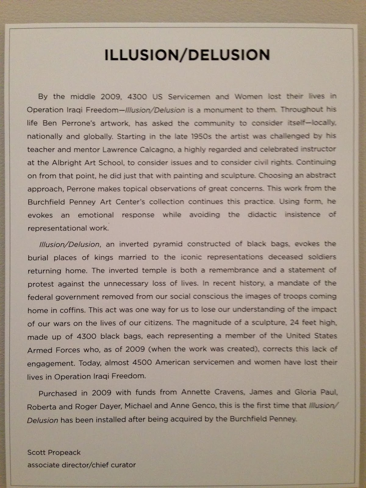
Artwork #3
Ben Perrone
Illusion/Delusion
Black paper bags and monofilament
2009
252x252x252 inches

"The sculpture, 24 feet high, is made up of 4300 black bags, each representing a member of the United States Armed Forces who lost his or her life in Operation Iraqi Freedom as of 2009."
The artist uses proportion to guide the viewers eye up the installation. Having the bags arranged like an upside down pyramid draws the eye up and creates movement. Light is also used by shining it from the bottom to create emphasis on the piece since the rest of the exhibit was pretty dim. The 3D bags also gave the installation texture.
What did you think of visiting the Gallery and purposefully looking at the exhibition from a different perspective - the physical space, the architecture, theme, etc.?
I thought it was a cool experience to look at things other than the artwork. I never really pick up on the architecture of the building, the lighting, etc. For the first part of the assignment i was basically ignoring the artwork which is an ironic thing to do at an art museum.
No comments:
Post a Comment