Sunday, September 29, 2013

Art Gallery Visit #1

Artworks that made an impact:


Tracy Emin
ONLY GOD KNOWS I'M GOOD
2009
Snow white neon, edition 2/3 plus 2 APs

This illuminated light saying of "only God knows I'm good" had a spiritual impact on me. To me it was saying what ever choices I make in life God will always be the one saying I'm alright even when everyone else turns their backs.


John Ahearn
Pinwheel, 1998
Plaster
This had a positive impact on me because it shows all of the different hands coming together for one common purpose. It shows a sense of community and shape of the arms into a circle shows unity since a circle is never ending. Another way to look at it is that the hands are waiting for something since their palms are open but it seem that everyone has a fair chance and no hand is farther into the circle than another.
 
Artworks I feel a connection with:


Janine Antoni
CONDUIT, 2009
digital chromogenic color print and copper sculpture with urine verdigris patina, 2/10 and 4 artist's proofs
 
I felt a connection with this photograph because as a fashion student it look very editorial to me. I looks like an advertisement for a clothing brand or a perfume. The women looks free and standing outside with a breathtaking view and hair blowing in the wind. It would make the consumer think that they would feel the same way while wearing this dress.


Kim Adams
Panel Van II, 2007
plastic and paint
 
I really felt a connection with the VW van because it embodies the 70's which is an era I am obsessed with. The sea foam green color and crochet pattern gives it a vintage feel with I love. It was a new and unique take on a classic car of the 70's and I honestly wish I could own this piece of art.
 
Artworks I would like to know more about:
 
Kiki Smith
Born, 2002
Bronze, edition 2/3
 
This sculpture looks like a deer giving birth to a fully grown women which is something I would like to know more about since its not something that happens in human nature. I feel like the artist is trying to suggest that as human we cant live with out animals and they are reliant on us but we are actually very reliant on them. This is definitely a piece that gets people taking and could have many different interpretations.
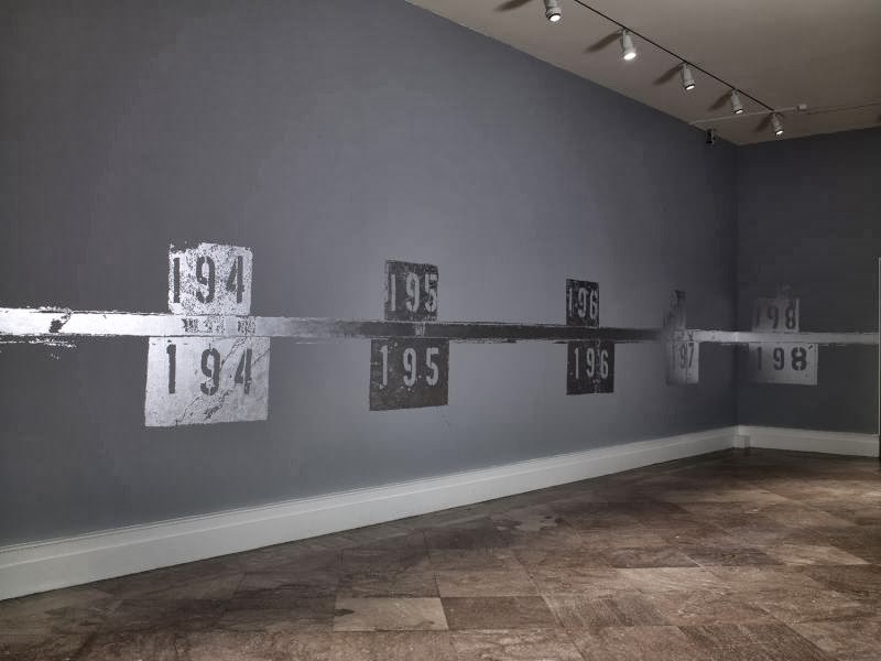


 Ingrid Calame
Mittal Steel No. 1 Shipping 192-208
2009
Latex and enamel paint

This large painting across the floors and ceilings in the gallery was a such a cool experience. As you walk across the silver paint revels painted numbers, footprints, and tire tracks. I had no idea as what these symbols represent but on the Albright Knox website the artist recreated the numbers that were painted and repainted on the floor of the ArcelorMittal steel plant. She tried to " combine history, physical fact, decay, memory, and personal experience." I would like to know more about the history of this steel plant and why these numbers impacted her so much that she want to create this.


Saturday, September 28, 2013

Logo Design


#1. I thought that creating a logo was a creative way to brand myself and show who am just through a simple picture.

#2. I knew I wanted to draw a sunflower because I have always associated them with being something happy with a hippie vibe which is how I live my life. I am a vegan and love all things organic and from nature. So a sunflower is perfect for a care free attitude on life. In my sketches I played with color and pattern to figure out what was the most ascetically pleasing. I implemented value by contrasting the dark to light shades of yellow and I think it balanced out the logo because it wasn’t the typical yellow sunflower. It made for of an impact to do an unexpected pattern which would make the logo more memorable especially of it was used for a product.

#3 The most important discovery I made was that it was really easy to pick what would be in a logo design for myself. When you really know who you are and what you are passionate about in life it is easy to express yourself creatively.

#4. . I learned that an effective logo should be simple, yet timeless to really make an impression on the consumer or the public so that is memorable and people notice it and recognize it right away. The videos showed all the steps need to complete the logo making process. From pitching the ideas to the company, presenting the logo to the web and using it for advertising, and finally showing the final product.  


Saturday, September 21, 2013

Module #4 Color Wheel And Value Scale


#1. I remember creating a value scale and color wheel back in elementary school. It brought back the basic principles of color, such as what primary colors mixed together create secondary colors. The value scale was the harder of the two to create. I shaded as directed from black to white but I feel like it would have been easier to go the opposite way because it was easier to add pressure than to let up on the pencil.
#2. I enjoyed working with the acrylic paint because painting is a lot more fun than shading with a pencil and mixing the colors together to get a nice shade for the secondary colors was pretty fun.
#3.  When I was creating the color wheel I used paints that I already had at my house. The redish pinkish color I used rather than magenta really affects the color wheel. It looked fine at first but dried a little darker than I would have liked. When I mixed the colors for the center it took a while to get it black because it was not a true magenta.
#4. The most important thing I learned was that red, yellow, and blue are actually not the primary colors, the real primary colors are cyan, magenta, and yellow. When mixed together red, yellow, and blue make brown. But cyan, magenta, and yellow make black. The videos were great for reminding me the order of the color well and what the color wheel and value scale should look like.


Sunday, September 15, 2013

Project #1

http://s1216.photobucket.com/user/courtspepper1/slideshow/AED%20200%20Elements%20and%20Principles


The elements and principles of design are evident in all aspects of life. As I took photos or went through photos I had taken over the summer it was impossible to not be able to instantly identify at least one element or principle. Some jump right out at you like the texture of my puppies luscious fur makes you want to touch it. Or the pattern of the patio walkway has an obvious pattern of square like shapes. Others were not so easy to identify such as, contrast and balance. I chose the bright flowers next to the dull fire hydrant to show the contrast between hard and soft objects. Balance was shown through the landscape being divided between the hydrangeas and the trees. The element of value was my favorite picture in the slideshow because it dramatically showed to difference between light and dark. I took these photo in many locations including my house, backyard, and from multiple vacations I went on during the summer. Tennessee and Cape Cod are where I took the most interesting and dynamic photos.

Saturday, September 14, 2013

Module #3: Color Theory


#1. Specific colors can have cultural or individual associations. These colors are symbolically or to set a mood. For example red can symbolize danger and anger while some see it as passion or love. The My Art Studio website had a cool slideshow about how we all associate certain colors with certain objects. Such as a red stop sign or a green light that means go. If we switched their meanings people wouldn’t know what to do while driving and it would disrupt our way of life.

#2. I found color schemes as being the aspect of color that fascinates me most. As a fashion major, design has a lot to do with how while the colors go together and complement each other. Monochromatic color schemes can have a unifying effect while analogous colors are next to each other on the color wheel and create harmony. By selecting two colors on opposite sides of the color wheel, a complementary color scheme is created. If these “rules” are not followed the garment would not be atheistically pleasing and people wouldn’t want to wear it.

#3. Color brings out visual emotion and physiological emotion. It only takes the use of one color to get the artists point across and make their emotions known. I found the paintings of Mark Rothko and is idea of how color is such a powerful medium that it can make everyone that is around it feel intense emotions towards it. His paintings were meant to decorate the Four Seasons restaurant in New York. Rothko hated the place and made paintings that would “ruin the appetite” of everyone that ate there. He hoped his intense reds and maroons would make the diners feel trapped in the room. It is crazy to think a painting of a single color could evoke all these emotions and subconsciously make people not want to eat at a restaurant.

#4. Goya paints portraits of disaster, despair, and violence. He believed you couldn’t have equality, brotherhood, or freedom without these monsters. His use of dark, dull colors gives the observer an uneasy feeling. He seems to see the negative in situations to give a painting a new vibe from the original intent.  


Saturday, September 7, 2013

Module #2


#1. Key Concepts

a.)    Aesthetics: Philosophy of the Arts

Over time theories about aesthetics has differed between each philosopher. Dating back to fifth century Athens, Plato believed “There is a beauty by which all things are beautiful.” He could tell the difference between reality and illusion and between what is fake and real. The first modern theory of aesthetics came in 18th century England and the idea was that the sense of beauty is innate and spontaneous. This is the complete opposite of Plato who believed in reason. Other theories like Dewey, Kant, and Danto show that aesthetics is always evolving to appeal to the time period, artists, artwork, and audience. We all have a different view points on what makes something beautiful but in some way they are all intertwined.


b.)    CARTA

Ramachandran and Changeux explain the psychological aspect of art and how it evolves from the brain. When we look at artwork we are using the conscious and unconscious parts of the brain. This then effects our emotions and how we perceive the art. This relates to chapter 1 that talks about the brain in relation to people who are considered creative.


c.)     CNN Article

Our brains can easily see lines, colors, and patterns and make sense of them because they are familiar to us. Artists create illusions such as depth and brightness that are actually there but make the art more realistic. The brain responds well to familiarity and nature. Lines, emotions, color, and symmetry all affect our senses and our brains use these elements to make sense of the art and make it appealing.


#2. In 1936 German philosopher, Walter Benjamin’s concept that art has been radically altered by technological advances that allows for unlimited reproduction of works of art was most important to me.  Movies, artwork, and television shows can easily be repeated and shown to everyone simultaneously. This makes them no longer unique and aesthetics now need to change and adapt to these advances. Aesthetics now involves to observer in the creation of the art being produced. With new technology comes a demand from the observer to want to watch what they believe is aesthetically pleasing and the artist has less control over their own craft and work.


#3. Ramachandran and Changeux’s scientific view of aesthetics and art explained the scientific aspect of aesthetics very well but as someone who doesn’t know much about art and science I felt it was very hard to understand. I think art is not solely derived from science but more from the cognitive aspects. Changeux had pictures of the brain when it is experiencing different emotions and feelings such as the feeling of surprised with I thought was cool to see how the brain changes during these times. Ramachandran had a great theory on natural selection by using the birds as an example. The female birds go for the aesthetically pleasing or attractive male birds which is also so true about humans. We want the handsome, strong male to mate with like the birds.

 
#4. The articles and the videos relate to the topics of aesthetics, how the brain interprets art, how we perceive elements of design like line and color, and cultural differences through art.


#5. I thought the aesthetics video was easy to understand and allowed me to understand the evolution of aesthetics through many viewpoints. Such as philosophy, science, reason, and emotion. The other Carta video was hard to follow, quite boring and I didn’t take much away from it as I did from the first video. The article I felt was very interesting and should how the brain works towards multiple elements of design and had information that I could actually relate to. For example using symbols on a keyboard to make faces or emotions through texting, like a smiley face. It may not look like a smiley face to some but our brains associate those symbols put together as a simple for happy.