Monday, December 9, 2013

Reflections of AED 200

1. What were you expectations for this course and where they met?

I expected to learn how to see art from a new perspective, different elements of design, be introduced to famous artists and their work, and I expect to have a new appreciation for art since I do not know much about art history. These expectations were met, I thought this class was going to be boring and I wouldn't care about the material but I learned a lot about art, and how it relates in my everyday life. 

2. Now that you've been through this course, What is art? How would you define it now compared to your intial posting?

Original Posting:
When I think of art the first thing that comes to mind is painting, drawing, sculptures, or museums. But I really think that art is an unique way to express ones emotions and individuality. Art is very subjective. What I think of when I see a piece of art can be completely different from someone else. Each piece can tell multiple stories.

I agree with my initial posting but I would add that art is all around us from architecture, rugs, vases, and culture that is often overlooked.  

3. Who was your favorite artist in your original posting and who is your favorite visual artist now? If there is a difference, why do you think so? If you have the same favorite artist, why do you think so?

My original favorite artist was Bansky, but after taking this class I learned a lot about Andy Warhol and he is my new favorite. I love his use of advertising and commercialism in his work. I think I changed my favorite because I wasn't exposed to any of Banksy's art throughout the semester.  

4. Now that you've completed this course, how do you feel about taking an online course? Is your answer the same as it was in your first posting? How is it the same or different?

This was my first online class along with another I took this semester. Compared to the other this class is so well organized and efficient than my other class, I am so glad I took this class. My answer was the same as before, I am a commuter student and I love not having to drive 30 mins to class when I can just do it at home. You really have to be self motivated which I am, and I am really happy with my grade and the overall experience of this course. 

Sunday, December 8, 2013

Project #5

1. Which projects did you review?
I looked through almost all of the art curation projects and liked a lot of them but ended up doing my article on the art exhibit Destruction of Happiness:Living Earth, created by Jeremy Roberts. 

2. Why did you select the Exhibit you critiqued?
I chose this exhibit because it had an interesting theme that is really evident in society today which is the destruction of the Earth through war and pollution. 

3. What challenges did you face in writing the critique article and how did you overcome them?
I thought it was hard to critique the exhibits because since all of the art was so similar I felt like I was running out of things to say. So to overcome this I looked on the creators blog to see what he wrote about his exhibit to get a better understanding of what he was trying to get across. 

4. How do you feel about critiquing your peers work?
I like writing about other people's work but I really enjoy reading what others have to say about mine, so I can better my work and see what my strengths and weaknesses are. 


5. Would you like to read the critique your peers wrote about your Art Curation Project?
Yes because as I stated before I really like hearing what other people think about my work, negative and positive. 

6. On a scale of 1-10 how would you rate your finished article and why?
I would rate my finished essay an 8 or 9. I feel like I gave a lot of detail about the exhibit and offered many suggestions for improvements and explained whether it was successful or unsuccessful. 

7. Did you enjoy working on this project?
I enjoyed putting my exhibit together but not so much the article. I don't enjoy writing papers like most college students, but two pages wasn't that bad, I was just running out of things to say after a while. 

Art Gallery Visit #3

Portrait of Mrs. A.G.M. van Ogtrop -Hanlo(1871-1944) and her five children
Therese Schwartze
1906
w198.5 x h175.3 cm

Madonna (Self- Portrait)
Cindy Sherman
1975
Gelatin Silver Print 
Profile Portrait of a Young Lady
Antonio del Pollaiuolo
1465
w362 x h522 cm
Oil on poplar wood
All portraits are from Google Art Project, I typed self- portraits into the search box so they didn't come from a specific gallery.


1. Why did you select the inspiration pieces?
I chose all portraits of women because I am also a women and would be creating my own self portrait similar to these. I also like how the women looked very glamorous and were posing how we would today even though the art is from a long time ago. 


2. Why did you select the media to create your self-portrait?
I chose pencil to draw the portrait and colored pencil to color it in. I chose these medias because they are something everyone has laying around the house and are easy to work with.


3. What challenges did you face in creating your self-portrait and how did you overcome them?
My biggest challenge is that I am horrible at drawing and trying to make myself look good in a drawing is hard when I can't get my vision across in a super creative way. But I tried my best despite my drawing skills. 


4. How does this piece represent you?
The piece represents me aesthetically and my personality, since I am smiling and it is just a basic everyday photo. 


5. What elements and principles of art did you apply in this work?
I used shape with the face, nose, and eyes, line for the hair, and color to make the portrait look better and show who I am. Such as skin color, hair color, and eye color. The hair and freckles give the 2D drawing texture. 


6. Did you enjoy working on this project?
I enjoy the art making projects because I don't every sit down and draw or paint and in my everyday life and this is nice break from essays and tests, since there is no right or wrong answers. 


7. What do you think of your final artwork?
I think my final artwork slightly looks like me, but if the original photo wasn't with it friends or family may not be able to know that it is me because I am the furthest thing from an artist. 


Saturday, December 7, 2013

Module 15 Video Blog

#1. Key Concepts:

Jackson Pollock: Michael Fried and T.J. Clark in Conversation
-Pollock is an enormously important modernist master
-Clark’s emphasis is on the historical role of modern art while Fried is focused on the independence of its aesthetic
-Both are committed to a historical way of looking at art
-Fried strongly dislikes the description of art in vulgar existentialist terms
-T.J Clark is a social historian that has been concerned with relating art to other human action
- Studying Lavender Mist: compressed energy of the painting surface
-Autumn Rhythm: Pollock focused on pictorial elements VS fragility

The Colonial Encounter: Views of Non-Western  Art and Culture
-Dahome art, visually beautiful but treated as a craft
-The 1900 Paris World Fair
-Colonial Images
-Images of African people showed violent behavior toward each other
-The shark symbolizes Dahome’s determination to protect its chores
-Algerian exhibition
-Racial differences
-Shows the ways in which Western prejudice, ethnography, and art consumption have counteracted authentic intercultural dialogue

#2. The videos showed that when critiquing art people can have varying interpretations of an artist’s work. This shows that the artist’s intentions for their work may not always translate to everyone on the same way. This was shown through Michael Fried and T.J Clarks conflicting views on the work of Jackson Pollock.

#3. I learned that art criticism must involve some sort of argument about the basis of the critic’s judgment. Also intuition and reasoning are an important part of art criticism

Monday, November 25, 2013

Project #4 Reflection

I found it easy to think of ideas for a theme for the art curator exhibition project. At first I wanted to do a 70's/bohemian themed exhibit, but found it hard to find artworks that matched that theme. So I came across a lot of nature related artworks such as flowers, animals and mountains while doing further research. I ended up choosing beaches as my theme. I named the exhibit "I Can Still Hear The Waves" since a majority of the artworks focused on the waves of the ocean, and the painting depicted real life beaches and are so detailed that the viewer feels like they are really on a sunny and exotic beach with the waves crashing down. I chose a font for the title that reminded me of writing your name into the sand , and the backgrounds for all of the slides was a pale blue that gives the exhibit a sense of calmness throughout the collection. I couldn't use the Bradley Hand font throughout the whole exhibit because I felt like it made the words hard to read, but I would have liked to use it. Also I arranged the artworks in a sequence from sunrise to sunset. So by going through the whole collection you kind of get to see a full day at the beach. From the calmness of the morning, to a beach party, to sunset, and to the darkness of the night. The websites that were given in the resource section were very helpful and made putting the PowerPoint together, really quick and easy. I had the most trouble with writing about the artworks since they are all about the beach it got very repetitive. But other than that I had no trouble coming up with a concept and putting it all together with fonts, colors and backgrounds that helped to reinforce my chosen theme better.

Saturday, November 23, 2013

Module #13 & #14

#1.  Key Concepts:

The Lowdown on Lowbrow: West Coast Pop Art

-Lowbrow art is art that isn’t categorized as any other type of art, it is a class all its own
-Pop culture, car culture, and folk art have had major influences in the genre
-Lowbrow had pop culture and consumer references
- Some galleries were not willing to display Lowbrow art
-There was unwillingness of the mainstream art world to accept Lowbrow
-Emergence of female artists in Lowbrow
-The punk rock generation propelled Lowbrow art culture

Displaying Modern Art: The Tate Approach

-The intellectual and aesthetic issues associated with the display of art
-Typically art was displayed in chronological order, representing each art movement
- Also the art was displayed on white walls with flexible lighting
-In 1970, these traditional way were questioned and art came off the walls to become busy and noisy
- The Tate Modern display approach
-Tate provided striking and often abrupt transitions between the individual display rooms
- Critics believed art should be more than entertainment

Bones of Contention: Native American Archaeology

-The remains of more than 10,000 Native Americans unearthed at archaeological sites across the U.S are in the possession of museums like the Smithsonian
-Anthropologists differ on whether or not the remains should be returned to their ancestors
-Now, Native Americans design the exhibits in New York’s Native American Museum
- Ancestors’ bones continue to be brought home
-Archaeology must share responsibility for stewarding the past

An Acquiring Mind: Philippe de Montebello and The Metropolitan

-Philippe de Montebello
- Served for 31 years as Director of The Metropolitan Museum of Art
-He guided the acquisition of more than 84,000 works of art
-He also demanded innovation in conservation techniques, and oversaw the doubling of the physical size of the institution

#2. The videos relate to the creation of my Art Exhibition project, since they talked about what type of art should be in an exhibit, how it should be displayed, what influences art displays, and what shouldn’t be a part of an exhibit.

#3. My favorite film was the The Lowdown on Lowbrow: West Coast Pop Art, it was like an exhibit that had no theme, which is the opposite of our project. But it was interesting to learn about Lowbrow which I’ve never heard of.


Saturday, November 16, 2013

Module #12 Video Review

#1 I chose the video Andy Warhol: Images of an Image because I really like his work and the way he incorporates advertising into his work. I also chose the video Abstract Expressionism and Pop: Art of the ’50s and ’60s because I like the emotion surrounding the expressionism movement and because the 60’s was my favorite decade.

#2. Key Concepts

Andy Warhol: Images of an Image:

-Was a commercial artist and used advertising images in his work

-Was inspired by famous women such as Marilyn Monroe and Elizabeth Taylor

-Used silk screening

-Photographs were blown up and developed onto silk screens, then transferred to paper and canvas using ink and paint

-Ten Lizes, 1963

-Used consumer products as repeated silk screen images

-Shot about 100 films

- Produced dozens of self portraits

-His work addressed race riots, the conquest of the moon, the cultural revolution in China, and the universal reign of the dollar

 Abstract Expressionism and Pop: Art of the ’50s and ’60s:

-Abstract Expressionism was born from joining the attitudes of American art and European avant-garde art

-It was later rejected for its nonfigurative and egocentric character and replaced by the ultra- objective phenomenon, Pop Art

-The video shows how various artists used expressionism in their art and the change to Pop Art
-Frankenthaler: feminine and mystical, and makes the observer experience a warming and exhilarating sense of fruitfulness (expressionism)

- Andy Warhol: most famous artist of the Pop Art movement, the first 20th Century art movement since Futurism to embrace the rhythms of city life

#3. The videos and the text both talk about when and how the Expressionism and Pop Art movement started, art works and artists during these movements, and what inspired Andy Warhol’s commercial and advertising based art.


#4. The films helped me to learn about the leaders of these art movements and the characteristics involved with these works of arts that define Expressionism and Pop Art.
                 

Sunday, November 10, 2013

Art Gallery Visit #2


Step #1: The Exhibition

#1. What is the title of the exhibit?

-Illusion/Delusion by Ben Perrone, at the Burchfield Penny Art Center.

#2. What is the theme of the exhibition?
-The installation is a tribute to the servicemen and women who died in Iraq.

Step #2: The Gallery

#1. What type of lighting is used?

-Track lighting is used to focus the viewer to the artwork since the light shines directly on the pieces. The rest of the exhibit had dim lighting to eliminate the unused space and create a sense of ambiance.

#2. What colors are used on the walls?

-The walls were painted white, I think that having colorful walls would distract from the artwork.

#3. What materials are used in the interior architecture of the space?   

-The walls of the gallery were made of drywall, and there were glass doors that led you into the gallery. The gallery is pretty basic and plain, since it is all about the art.

#4. How is the movement of the viewer through the gallery space?

-The gallery kind of reminds me of a smaller and simpler version if a corn maze. The viewer gets to pick which way to go, but there is no right way. Each path leads to more rooms and exhibits when you thought you saw all there was to see you come across another path.  This provides an unique experience for each person.

Step #3: The Artwork

#1. How are the artworks organized?

-The artwork is organized by exhibit and I noticed that the art is hung at eye level and is level with all the other artworks in the exhibit.

#2. How are the artworks similar?

-There were multiple display cases with pictures of servicemen and news articles. All these things represent one common theme, the unnecessary loss of life.  

#3. How are the artworks different?

-The artworks were different because some were very literally like the photos of the servicemen while some were very abstract like the hanging black bags that represent each life lost in Iraq.

#4. How are the artwork framed?

-The art work in the exhibit I visited, Illusion/Delusion was set on top of cream canvas in a glass frame with a very thin silver border.

#5. How are the artworks identified and labeled?

-Not all the artworks throughout the gallery and the exhibit were labeled. But when they were there was a small white plac underneath the art with all the info about it. Such as the artist, title, date, media, and sometimes a short description of the art.

#6. What is the proximity of the artwork to each other?


-The artworks in the Illusion/Delusion exhibit were spread very far apart which kept the viewer moving and every inch of the gallery was utilized. 


Artwork #1.
Adele Rieger Cohen
Untitled
Oil on paper
1965
The painting is if a circle with a black background, half of the circle is dark while the other is a little bit lighter. In the center it looks like the silhouette of a women to me. The artist uses shape through the use of the circle. There is emphasis on the light "face" of the women since the rest of the painting is dark with the colors black and red. Balance is used by having the "women" directly in the middle of the circle and there is not more empty space on one side then the other. I really can't tell what the artist is trying to convey because it seems really abstract to me. But to me it looks like a women covering her mouth with her arm as if she can't go on or is not supposed  to talk. She is also going to the lighter side of the circle, like the darker side was the dark past she was walking away from . In this case the past would be the war since that was the theme of exhibit. 


Artwork #2
Lawrence Calcagno
Rose Black
Watercolor and gouache on paper
1956
29 3/4 x 21 3/4 inches


The artwork Rose Black is very dark with black and a dark rust color. The darkness is broken up by a strip of cream with black spots and strokes. The artist uses value with the contrast of dark and light. Emphasis is used since the eye is brought directly to the lighter portion of the painting. The black strokes also give the painting texture and movement. Since the whole exhibit was about the tragedies in Iraq I think the light portion represents hope, kind of like there is a light and the end of tunnel.

Artwork #3
Ben Perrone
Illusion/Delusion
Black paper bags and monofilament
2009
252x252x252 inches

Ben Perrone’s installation is a tribute to the Servicemen and Women who died in Iraq. The 28 ft installation shows the enormity and impact of war. Perrone stated that "an inverted pyramid constructed of black bags evokes the burial places of kings married to the iconic representations deceased soldiers returning home. The inverted temple is both a remembrance and a statement of protest against the unnecessary loss of lives".
"The sculpture, 24 feet high, is made up of 4300 black bags, each representing a member of the United States Armed Forces who lost his or her life in Operation Iraqi Freedom as of 2009."

Along with the installation there was a video playing that showed the artist hand writing the names of the people who lost their lives and putting the names into the bags. It some galleries this installation is hug in front of the entrance so people have to walk through the sea of bags, as if they are being touched by the lives that were lost. 

The artist uses proportion to guide the viewers eye up the installation. Having the bags arranged like an upside down pyramid draws the eye up and creates movement. Light is also used by shining it from the bottom to create emphasis on the piece since the rest of the exhibit was pretty dim. The 3D bags also gave the installation texture. 

What did you think of visiting the Gallery and purposefully looking at the exhibition from a different perspective - the physical space, the architecture, theme, etc.?

I thought it was a cool experience to look at things other than the artwork. I never really pick up on the architecture of the building, the lighting, etc. For the first part of the assignment i was basically ignoring the artwork which is an ironic thing to do at an art museum. 

Saturday, November 9, 2013

Module #11 Video Review

#1.  I chose the videos Dada and Surrealism, and The Impact of Cubism because it is interesting to see the difference between art movements, how they started, what they focus on, and the leaders of these movements.

#2.  Key Concepts:

Dada and Surrealism

-The Dada movement was a reaction to World War l.

-Surrealism opened a new avenue for artistic creation by ignoring the reasoning process and tap directly into the unconscious mind.

- German artist Kurt Schwitters

- Realized the unlimited possibilities of collage, used rural objects in his art, and light dances off of his objects

-Hannah Hoch, Dadaist

- Used art to attack the society she detested

-“Cut With the Kitchen Knife”(1919) contained chaotic figures to make a monumental political statement

-George Grosz, “the saddest man in Europe”

-The Nazis burned his art

-“Pillars of Society”, a bitter attack on his enemies

-He despairs that WWI did not end the wicked ways of government

-Joan Miro, Spanish Surrealist

-“Dutch Interior II”, in his paintings one experiences two different ways of looking at the world

- Salvador Dali, surrealist painter, probes the darkest regions of the human subconscious, paints a world in which nothing makes sense

-Man Ray, “La Fortune”

The Impact of Cubism

-Unfamiliar, nonclassical ways to represent form and space

- Juan Gris, “The Breakfast Table”, used spiritual elements, imagination, abstraction and real objects.

- “The Violin”, used musical composition to layer elements of sound

-Duchamp’s, “Nude on a Staircase”, controlled motion is balanced in a fixed setting

- Spiral forms establish direction, focus attention and symbolize Electric lights

- Kazimir Malevich, Mysticism

-Mystical experiences represented in religious icons

-Umberto Boccioni, “Farewells”

#3. Both the readings and the text talk about how Dada, Surrealism, and Cubism effected how the viewer feels when looking at paintings from the movement, the elements the artists used during the movement, and the main artists and their works that best represented the movement.  


#4. I really liked The Impact of Cubism video and the artist Sonia Delaunay. She used the basic concepts of Cubism in her work as a fashion designer and interior decorator, and was a contributor to the Avant Garde trend in fashion which is still seen today. She encouraged the people she was designing for to follow their fantasy. 

Sunday, November 3, 2013

Module Ten- Art Making/Material Exploration Blog: Mask Making


#1. A bearded man with a colorful feathered headpiece. 
#2. A lizard looking animal with large scales, bright colors, a tongue sticking out, large dark eyes, and sharp teeth. 
#3. A bird mask with a large yellow beak and very long white hair surrounding its face. 

I chose these three masks because I knew I wanted to create a sort of tropical mask with bright colors, like you would see in the Caribbean. The tall head pieces on two of the masks create movement by leading the eye towards the tops of the mask. All of the masks have bright colors, and they all use pattern by having symmetry with the colors, head pieces, and the hair hanging off the bird. The hair also creates texture and the 3D features, and roughness of the facial features also creates texture. The large beaks on the birds are a focal point and create emphasis since it is protruding out and is one of the first things I noticed. The hair also shows the value between the hardness of the mask and the softness of the hair. The feathers on the mask of the man demonstrate balance between the tall and colorful feathers and the light skin of the man.  Lastly shape is used on the yellow and green spikes coming off of the lizard looking mask, the sharp edges and space between each spike gives the mask a more intense and animated feel. 


I used texture in my mask by using feathers as a head piece. The feathers show pattern by using certain colors a set sequence of colors. The beak also shows texture. I used small beads to cover to beak in all different shades of blue. The feathers and the beak balance out the rest of the face since they are 3d features and the face is 2d. The face is a pale shade of red so the bright blue beak is the focal point and is emphasized. Value is used since half of the face is a little bit darker with scales. While the other side is just shaded, this is hard to see in the photo. Shape is used with circles and stars around the eyes. And color is clearly used on the entire mask to make it vibrant and fun.  

Creating a mask is actually harder than it looks. It didn’t come out exactly how I planned. But I think I used many elements and principles which helped to make it look alright. I tried to used materials that were some what unconventional like beads and feathers. Overall this project, and all the material exploration projects we are assigned are a nice break from art history which can get a bit boring. It is a lot more fun to be creative than read a text book. 

Module #9 Hand Drawing


#1. As people we use are our hands every day in everything we do. By using my hands as subject matter it is interesting to see all the lines, wrinkles, and unique characteristics in my hands that I never noticed because I don’t ever just stare at my hands.

#2. I chose pencil because it was what I had available at the time. If I had charcoal on hand I would have liked to try both mediums to see the difference in the drawings.  

#3. It felt strange to use my left hand/ non-dominant hand because I never use it. I can barely right my name neatly with my left hand let alone drawing a picture with it.

#4. I ended up tracing my hand because I cannot draw to save my life. My non-dominant hand drawing is pretty shaky compared to my dominant hand. But I found that if I really concentrated using my left hand is not that hard.


#5. My picture using my non-dominant hand looked very shaky, like I was unsure about what I was drawing. So if I intentionally wanted this effect for a drawing or painting using my non-dominant hand could be a useful tool. 

Saturday, November 2, 2013

Module #10

#1. I chose the videos African Art and Chinese Art: Treasures of the National Palace Museum. I chose videos that were both about art from different cultures. It is interesting to learn the ways art is interpreted in different parts of the world.

#2. Key Concepts

African Art
-Aesthetic sense is shown in dress, hair styles, forms of ornamentation, rituals and performance art
- Ancient paintings represent animals and humans
- Egyptian and Saharan art
-Zimbabwean Art
-African art influence Picasso and Modernist painters
-Conceptual and flowing
-Religion in African art
-Masks and embellishments

Chinese Art: Treasures of the National Palace
- Highlighted 33 works of Chinese art see in the National Palace Museum
-Pottery, tea bowls, curio cabinets, vases
-Historic bronze
-Calligraphy, Buddha, Bodhisattvas
-Ink stone, bamboo


#3. Both videos relate to the text since both discuss the ways African and Chinese art are created, their influences, religious beliefs, and the diversity of art forms between regions of the country.  


#4. The videos showed what type of art is important to the African and Chinese culture. Some of the works that were highlighted in the videos I didn't know they originated from these regions and they influenced they had on pottery or rugs we may have in our own homes. 

Saturday, October 26, 2013

Module #9 Video Blog

 #1. I chose videos that were based on artists I know nothing about. I’ve learned about artists such as Michelangelo and Leonardo da Vinci but El Greco and Caravaggio were artists I haven’t heard of and would like to know more about.

#2. Key Concepts
Video #1. El Greco: Rediscovering a Master
-One of Spain’s greatest painters
-Had an interest in controversial counter- reformation in pictorial art
-Considered the great predecessor of the modernism
- He respected and established norms without sacrificing style
-Other artists were inspired by his work
- Most genuine of Spanish artists

Video #2. The Power of Art: Caravaggio
-Painted the here and now and used people off the street for models
- “The Calling of St. Matthew”
- Society considered his paintings indecent
-“The Death of the Virgin Mary”
- Went in to hiding
- In 1608 he was proclaimed one of the greatest of all painters
- “The Beheading of John the Baptist”
- Ultimately died a miserable death

#3. The videos talked a lot about the artist’s views on religion during the time of the renaissance. The artists expressed their view on religion and some showed it in holy way and some in an evil way. The book also talks about religious views during the renaissance of several other artists.

#4. The videos opened me up to other artists I would most likely never learn about. The book usually talks about very well-known artists like Michelangelo. So I wanted to learned about other artists views and works.


Saturday, October 19, 2013

Module #8

#1. I chose the video The Measure of All Things: Greek Art and the Human Figure because I think sculptures that depict the human body and the emotions behind it are interesting to learn more about.

#2.
More Human Than Human: Key Concepts
-People and artists are obsessed with the human body
- Images of the human body do not actually resemble a real human being
- One of the first images of the human body was a statue of the female figure found in the Danube River Valley
- Statues of the female body often had exaggerated breasts, genitalia, and hips
- Human ancestor’s brains might have been programmed to exaggerate these features because they felt they were of greatest importance
- The instinct to exaggerate did not survive into the Egyptian era.
- The Greeks made realistic images
- The Greeks cared more about physical perfection of the body

The Measure of All Things: Greek Art and the Human Figure: Key Concepts
-History of statues in the 5th and 6th century
- Greek pottery
- Depicted everyday life as well as the Gods
- The Olympic Games
- Idealized the human body, strength and beauty
- The obsession with the ideal beauty and the body still is evident today.

#3. Both videos are about how artists see the human body and sometimes it is shown unrealistically or realistically in works of art, like statues. The text also talks about the beauty and ideal view of the human body and both talk about the Greeks influence on human statues.


#4. The videos were helpful in showing how the body evolved in sculptures over the centuries and different views on the body like the Greeks, Romans, and Egyptians. It also showed how and why the body is created realistically, or ideally. 

Saturday, October 12, 2013

Module #7 Video Review

Video #1

Last Call for Planet Earth: Sustainable Development and Architecture

#1. Key Concepts

- Major changes in building design is needed to help protect our planet which is in danger
-Eco-friendly materials are a growing trend among architects
-These materials include bamboo wood and the use of new technologies such as green roofs, and passive and geothermal solar energy usage
-The video also talked about being environmentally aware, and sustainability, since people use resources without caring about how it will affect the environment

Video #2

Imperial Rome, Ostia, and Portus: Ancient Architecture and Technology

Key Concepts

- Roman technology
- Architecture of Rome, Ostia, and Portus, their natural resources and history of buildings
- The Parthenon and Greek columns
-Baths of Caracalla, mosaics
-Domes
-Water and sanitation systems

#2. The video relates to the text because both talk about the idea of green architecture. Also they both give examples of eco-friendly materials that can be used and unconventional ways to help the environment through architecture, like roof top insulators and ways to incorporate natural light, fresh air, gardens,and beauty. The second video relates to the book because both talk about the contributions of the Greeks and Romans in architecture and both used the example of the Parthenon.

#3. The video showed many different interviews from architects and they all have their own interpretation of how to sustain the planet through architecture. This showed that big and small ideas all contribute to the overall goal of protecting the planet. The second video the different technologies used in building design and how they have evolved throughout history and the way several countries use them.

#4 I chose these videos mostly based on their titles. I wanted to pick videos that would touch on topics I find interesting such as, technology, and helping the environment.

Saturday, October 5, 2013

Peer Review

http://mtnewton90.blogspot.com/ & jennalettieri.blogspot.com


#2. I thought Jenna's elements and principles were very well thought out and easy to spot even if you weren't too familiar with their meanings. On the other hand Matt had some elements and principles I was not aware were actual elements and principles so I was kind of confused by this. A lot of their images could have other elements and principles other than the one listed with the picture. Such as color, shape, pattern, and line which are very common and easy to find.

#3. There were not any images that were the same, which I expected since the Albright Knox is so large and what might catch my eye when walking through may have no effect on someone else.

#4. Matt used Black Friday for his gallery visit with really interested me. Working in a retail store I am used to the craziness of Black Friday and could easily relate to this artwork. I wonder what connection the artist has to Black Friday that made them want to create this.

#5. I think it is helpful to read my peers reflection because we learn more from each other. By reading other people's ideas I can see other view points and understand things that may be confusing the first time I read it. That's why it is nice that our blogs are not private. If I am confused about a project or assignment that is posted to our blogs I can look at some other people's and get a sense of what is expect and feel more confident about my work.

#6. I found most students comments very vague and basic. Most said good job or I liked your project. I prefer to go more into detail and let the person know specific things i liked and why because I think it is more helpful.

Module #6 Video Review

Through the Eyes of the Sculptor

#1. I learned that sculpting is a very time consuming and intense process. Also the artist needs to consider many factors when carving the marble or limestone to make sure the sculpture will be successful. Elements like how much can the stone handle, can it be extended, how fragile is it, how resistant is it, and will it be indoor or outdoor. As the view we get to see the beautiful end product and don’t relive the amount of time, energy, and planning that goes into it.

#2.The video relates to the text because they both showed the different methods that can be used to make sculptures. Such as modeling, casting, carving, and assembling.

#3. This video showed that sculpting is not a craft that just anyone could pick up. You have to be passionate about it like Fillion who started at a young age. He started as restoring old monuments and buildings, and later became a master sculptor.

Glass and Ceramics

#1. I learned that glass is made from sand with is one of the most abundant substances on the surface of the earth. Its properties are extremely different from sand and is actually a liquid that stiffens when cooled rather than a solid. Like glass ceramics came into existence by fire but is made from a clay which is a rock.

#2. This video relates to the text because both talk about the methods of creating these materials. These techniques include blowing and staining for glass, and slab construction, coiling, using a potter’s wheel, and glazing for ceramics.


#3. I thought this film was really interesting be it went into depth and demonstrated how to use the different techniques to create glass and ceramics. My favorite was the glass being blown; it was amazing how he could just heat up the glass and simple remove parts he didn’t want just by cutting them off until he thought it was perfect. I normally think of glass as being fragile and having to be really careful. By altering the state of the material anything is possible. 

Sunday, September 29, 2013

Art Gallery Visit #1

Artworks that made an impact:


Tracy Emin
ONLY GOD KNOWS I'M GOOD
2009
Snow white neon, edition 2/3 plus 2 APs

This illuminated light saying of "only God knows I'm good" had a spiritual impact on me. To me it was saying what ever choices I make in life God will always be the one saying I'm alright even when everyone else turns their backs.


John Ahearn
Pinwheel, 1998
Plaster
This had a positive impact on me because it shows all of the different hands coming together for one common purpose. It shows a sense of community and shape of the arms into a circle shows unity since a circle is never ending. Another way to look at it is that the hands are waiting for something since their palms are open but it seem that everyone has a fair chance and no hand is farther into the circle than another.
 
Artworks I feel a connection with:


Janine Antoni
CONDUIT, 2009
digital chromogenic color print and copper sculpture with urine verdigris patina, 2/10 and 4 artist's proofs
 
I felt a connection with this photograph because as a fashion student it look very editorial to me. I looks like an advertisement for a clothing brand or a perfume. The women looks free and standing outside with a breathtaking view and hair blowing in the wind. It would make the consumer think that they would feel the same way while wearing this dress.


Kim Adams
Panel Van II, 2007
plastic and paint
 
I really felt a connection with the VW van because it embodies the 70's which is an era I am obsessed with. The sea foam green color and crochet pattern gives it a vintage feel with I love. It was a new and unique take on a classic car of the 70's and I honestly wish I could own this piece of art.
 
Artworks I would like to know more about:
 
Kiki Smith
Born, 2002
Bronze, edition 2/3
 
This sculpture looks like a deer giving birth to a fully grown women which is something I would like to know more about since its not something that happens in human nature. I feel like the artist is trying to suggest that as human we cant live with out animals and they are reliant on us but we are actually very reliant on them. This is definitely a piece that gets people taking and could have many different interpretations.


 Ingrid Calame
Mittal Steel No. 1 Shipping 192-208
2009
Latex and enamel paint

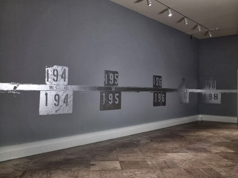
This large painting across the floors and ceilings in the gallery was a such a cool experience. As you walk across the silver paint revels painted numbers, footprints, and tire tracks. I had no idea as what these symbols represent but on the Albright Knox website the artist recreated the numbers that were painted and repainted on the floor of the ArcelorMittal steel plant. She tried to " combine history, physical fact, decay, memory, and personal experience." I would like to know more about the history of this steel plant and why these numbers impacted her so much that she want to create this.